The article below accurately describes the usefulness of fundamental analysis: It is not useful for short term forecasting, e.g. 1 year. It is a lot more useful for a longer term return forecast, e.g. 10 years.
Nevertheless, from the CAPE ratio for S&P500, evidence are mounting that we are in the second half of the bull run. I'll venture further forward to say that we are 2/3 of the way to the end. My view is this:
1. EM and Asian equities may outperform developed markets from 2014 - 2016. I especially like Chinese cyclicals now.
2. Sectors and markets that peaked in 2011 and dropped 30 - 40%, e.g. mining sector will outperform.
3. Technology and banks will also outperform.
4. US, Europe and Japan will still notch new highs from now till 2016, but will not be at the same rate as the first 2/3 of the bull run, from 2009 - 2014.
What are the signs that stock markets have peaked? They are:
1. The signs are the same, whether in 2006, 1999 or at any point in history. The respective sovereign yield curve will invert.
2. Inflation will begin to tick up, causing governments to hike rates in order to tame inflation.
3. Eventually, the economy will slow, prompting investors to flock to longer term treasury bonds, pushing yields below the short term rates.
4. But does it apply in today's "artificial markets"? I'd use the Taylor rule. It now states that the Fed Funds Rate should be at 2%. The 10-year US Treasury is at 2.54%. The yield curve is rather flat, but still normal sloping.
5. The yield curve won't invert until US unemployment falls below 6%, wages rise and inflation rises. I don't see this until 2H 2015. I foresee the US FFR reach 1% end 2015, 2.5% end 2016. The Taylor Rule rate should be 3% by end 2015, almost inverting the curve. It will reach 4.5% end 2016. In fact the yield curve according to Taylor's Rule will invert sometime in 1H 2016 and the US govt will be in denial that there will be a recession soon.
Between now and 2016, I favour the following asset classes:
1. For bonds, I prefer Asian high yields because the yield curve is flattest in Asia. I'd go for Fidelity Asian High Yield.
2. For balanced funds, I prefer JPMorgan Multi Income.
3. For equities, I'd go for Fidelity Global Dividends, First State Regional China, First State Global Resources, Henderson Tech, Aberdeen Europe.
Don't Listen To Bubble Speculation

As you can see above, the Dow has spent the last week or two hovering around a significant numerical milestone. In fact, there were several days when the Dow closed above that value leading to a flood of poorly thought out doomsday articles (here's a particularly bad example of a doomsday article). In spite of the nonsense, we can still learn something from all of the noise the financial media is generating; specifically, what not to do. All investors are human and are therefore subject to cognitive biases when making investment decisions. When cognitive biases are mixed with the misunderstanding of valuation metrics, the result is usually bad decisions. I'll start with the misunderstanding of valuation metrics.
(click to enlarge)
Source: data provided by Robert Shiller, graph from multpl.com.
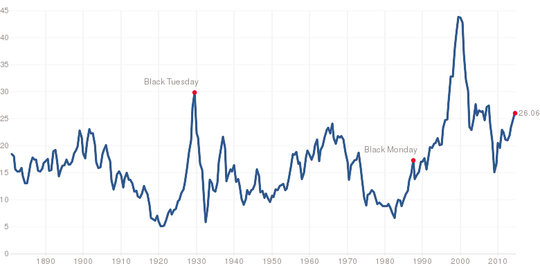
The chart above is Robert Shiller's CAPE (Cyclically Adjusted PE) ratio. CAPE has been in the news a lot over the last few years; however, if you are not familiar with CAPE, here is a brief summary. CAPE is calculated using a 10-year, inflation adjusted, moving average of the PE ratio. The moving average allows for much of the short-term volatility to be filtered out, providing a much better indication of the long-term potential for the stock market. The long-term average value for CAPE is 16.54 and the current value is 26.06; about 57.55% above the long-term average.
In fact, the overvaluation suggested by CAPE has a lot to do with the amount of attention it has been given in the last year or two. There are several metrics that indicate the market is currently overvalued, but CAPE was one of the first indicators to suggest the market was overvalued. With the significantly negative bias in the media's market outlook and the many pundits calling for a crash, CAPE became the indicator of an imminent crash. The problem is that CAPE is not a tool for timing the market, to see that, consider the chart below.

Source: Bloomberg View.
There is no better way I can think to make the point. The current value of CAPE has very limited predictive power over a 1-year time span. Also, keep in mind that the chart is showing median returns; it's not an absolute predictor of returns. CAPE is telling us that we should expect stocks to do poorly in the long-run at current valuations, but it's not saying anything about a correction, crash, or a bubble. I would also suggest caution when working with valuation metrics such as CAPE; it's best to use more than one before you decide if the market is overvalued. My final point on valuation metrics is that they all suffer from the same problem that CAPE does, to a great extent. There are no measures that can tell you when a crash or correction is coming.
Now, you may argue that there are other reasons to believe that there is a market bubble other than CAPE: QE, length of the current bull market, the VIX, all time highs, economic ruin, and so on. I've already addressed the VIX in a previous article, so I will not cover that here. With respect to the others, I will direct readers to one of my favorite articles about the problem of storytelling in the context of investing (The Narrative Fails). However, I will provide a few data points that indicate the economy continues to move in the right direction (and therefore is not going to cause a market crash).
(click to enlarge)
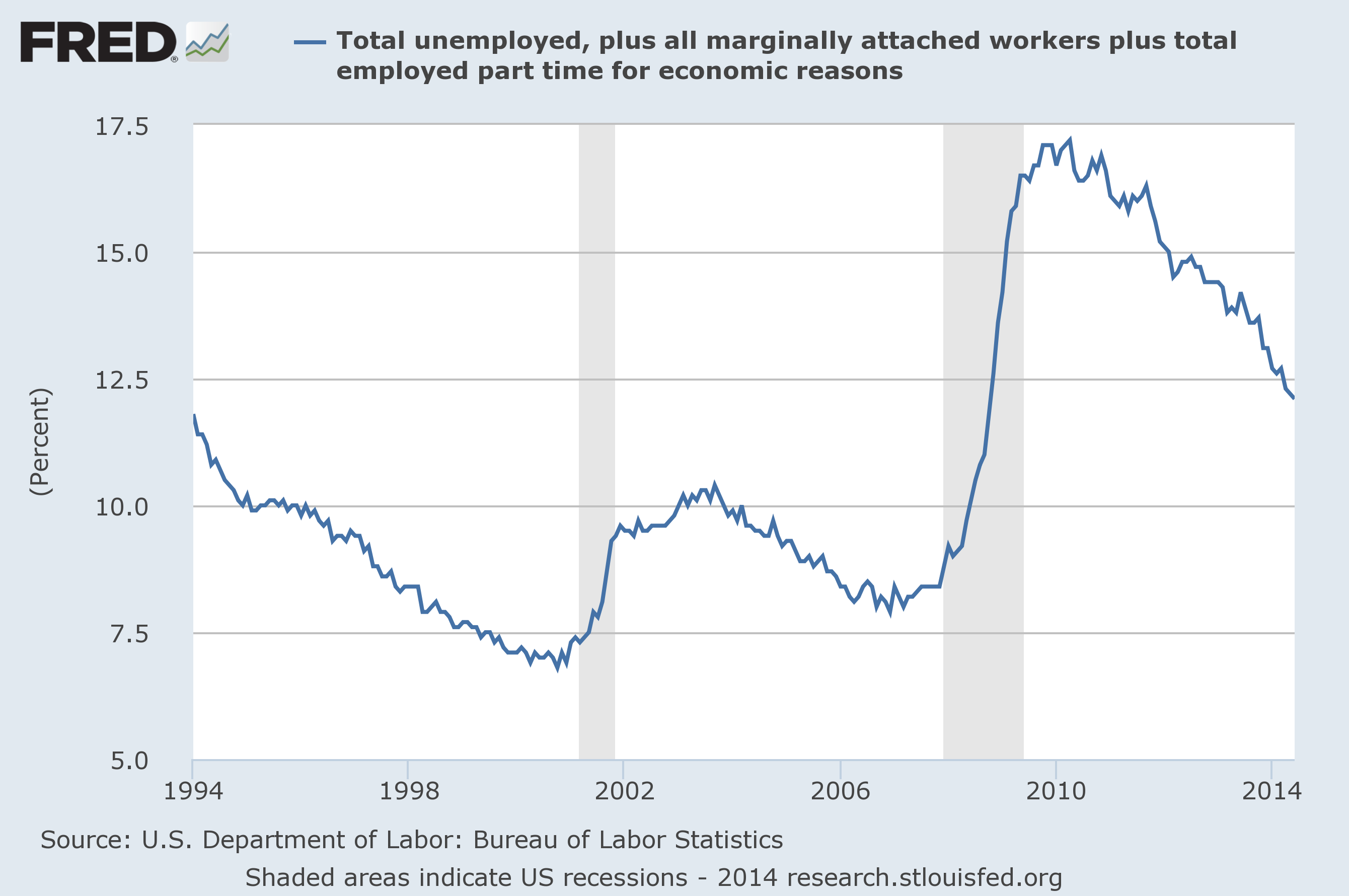
First, the unemployment rate has continued to decline, though it remains elevated. Clearly, unemployment is moving in the right direction and does not show signs of stalling or reversing. Even if we expand unemployment to include marginally attached workers (chart below), the situation is still improving. Given the magnitude of the financial crisis, it's not hard to believe that the recovery will take much longer than for a less serious recession. Furthermore, the improvements in both measures of unemployment appear to be accelerating. While I can't predict the future, that certainly doesn't fit with the idea of a slowing economy.
(click to enlarge)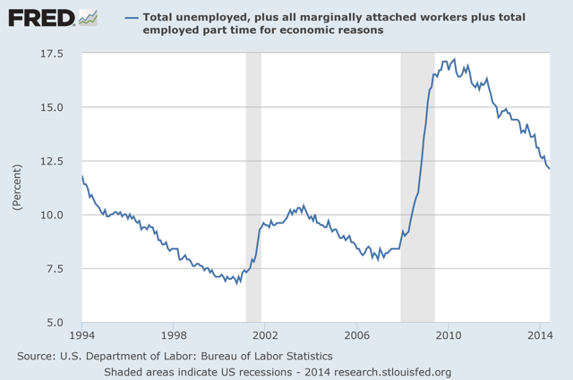
This leads me back to the point I mentioned above about the narrative. Much of the doom and gloom outlook on the economy is politically motivated. It doesn't matter what your political views are; keep them out of your investing decisions.
(click to enlarge)
There is one final point I would like to make about the absence of a market bubble. The chart above is the National Financial Conditions Index (NFCI) subindex (one of three) measuring nonfinancial leverage. From the Federal Reserve website:
Just to be clear, I'm not saying that there will be 10 more years to this bull market. My point is simply that claims of a market bubble are fairly weak. Even if there is a bubble, I would be willing to bet that most pundits are wrong about the reasons, and they only get the timing correct by luck. That's just how the market works; it's only easy in hindsight.
Nevertheless, from the CAPE ratio for S&P500, evidence are mounting that we are in the second half of the bull run. I'll venture further forward to say that we are 2/3 of the way to the end. My view is this:
1. EM and Asian equities may outperform developed markets from 2014 - 2016. I especially like Chinese cyclicals now.
2. Sectors and markets that peaked in 2011 and dropped 30 - 40%, e.g. mining sector will outperform.
3. Technology and banks will also outperform.
4. US, Europe and Japan will still notch new highs from now till 2016, but will not be at the same rate as the first 2/3 of the bull run, from 2009 - 2014.
What are the signs that stock markets have peaked? They are:
1. The signs are the same, whether in 2006, 1999 or at any point in history. The respective sovereign yield curve will invert.
2. Inflation will begin to tick up, causing governments to hike rates in order to tame inflation.
3. Eventually, the economy will slow, prompting investors to flock to longer term treasury bonds, pushing yields below the short term rates.
4. But does it apply in today's "artificial markets"? I'd use the Taylor rule. It now states that the Fed Funds Rate should be at 2%. The 10-year US Treasury is at 2.54%. The yield curve is rather flat, but still normal sloping.
5. The yield curve won't invert until US unemployment falls below 6%, wages rise and inflation rises. I don't see this until 2H 2015. I foresee the US FFR reach 1% end 2015, 2.5% end 2016. The Taylor Rule rate should be 3% by end 2015, almost inverting the curve. It will reach 4.5% end 2016. In fact the yield curve according to Taylor's Rule will invert sometime in 1H 2016 and the US govt will be in denial that there will be a recession soon.
Between now and 2016, I favour the following asset classes:
1. For bonds, I prefer Asian high yields because the yield curve is flattest in Asia. I'd go for Fidelity Asian High Yield.
2. For balanced funds, I prefer JPMorgan Multi Income.
3. For equities, I'd go for Fidelity Global Dividends, First State Regional China, First State Global Resources, Henderson Tech, Aberdeen Europe.
Don't Listen To Bubble Speculation
Disclosure: The author has no positions in any stocks mentioned, and no plans to initiate any positions within the next 72 hours.
Summary
- It's not worth investor's time to listen to the endless bubble speculation. Most of the arguments in support of a market bubble are weak.
- Valuation measures cannot help with market timing; they work well only when considering long time periods.
- Economic data does not indicate an imminent recession.
As you can see above, the Dow has spent the last week or two hovering around a significant numerical milestone. In fact, there were several days when the Dow closed above that value leading to a flood of poorly thought out doomsday articles (here's a particularly bad example of a doomsday article). In spite of the nonsense, we can still learn something from all of the noise the financial media is generating; specifically, what not to do. All investors are human and are therefore subject to cognitive biases when making investment decisions. When cognitive biases are mixed with the misunderstanding of valuation metrics, the result is usually bad decisions. I'll start with the misunderstanding of valuation metrics.
(click to enlarge)
Source: data provided by Robert Shiller, graph from multpl.com.
The chart above is Robert Shiller's CAPE (Cyclically Adjusted PE) ratio. CAPE has been in the news a lot over the last few years; however, if you are not familiar with CAPE, here is a brief summary. CAPE is calculated using a 10-year, inflation adjusted, moving average of the PE ratio. The moving average allows for much of the short-term volatility to be filtered out, providing a much better indication of the long-term potential for the stock market. The long-term average value for CAPE is 16.54 and the current value is 26.06; about 57.55% above the long-term average.
In fact, the overvaluation suggested by CAPE has a lot to do with the amount of attention it has been given in the last year or two. There are several metrics that indicate the market is currently overvalued, but CAPE was one of the first indicators to suggest the market was overvalued. With the significantly negative bias in the media's market outlook and the many pundits calling for a crash, CAPE became the indicator of an imminent crash. The problem is that CAPE is not a tool for timing the market, to see that, consider the chart below.
Source: Bloomberg View.
There is no better way I can think to make the point. The current value of CAPE has very limited predictive power over a 1-year time span. Also, keep in mind that the chart is showing median returns; it's not an absolute predictor of returns. CAPE is telling us that we should expect stocks to do poorly in the long-run at current valuations, but it's not saying anything about a correction, crash, or a bubble. I would also suggest caution when working with valuation metrics such as CAPE; it's best to use more than one before you decide if the market is overvalued. My final point on valuation metrics is that they all suffer from the same problem that CAPE does, to a great extent. There are no measures that can tell you when a crash or correction is coming.
Now, you may argue that there are other reasons to believe that there is a market bubble other than CAPE: QE, length of the current bull market, the VIX, all time highs, economic ruin, and so on. I've already addressed the VIX in a previous article, so I will not cover that here. With respect to the others, I will direct readers to one of my favorite articles about the problem of storytelling in the context of investing (The Narrative Fails). However, I will provide a few data points that indicate the economy continues to move in the right direction (and therefore is not going to cause a market crash).
(click to enlarge)
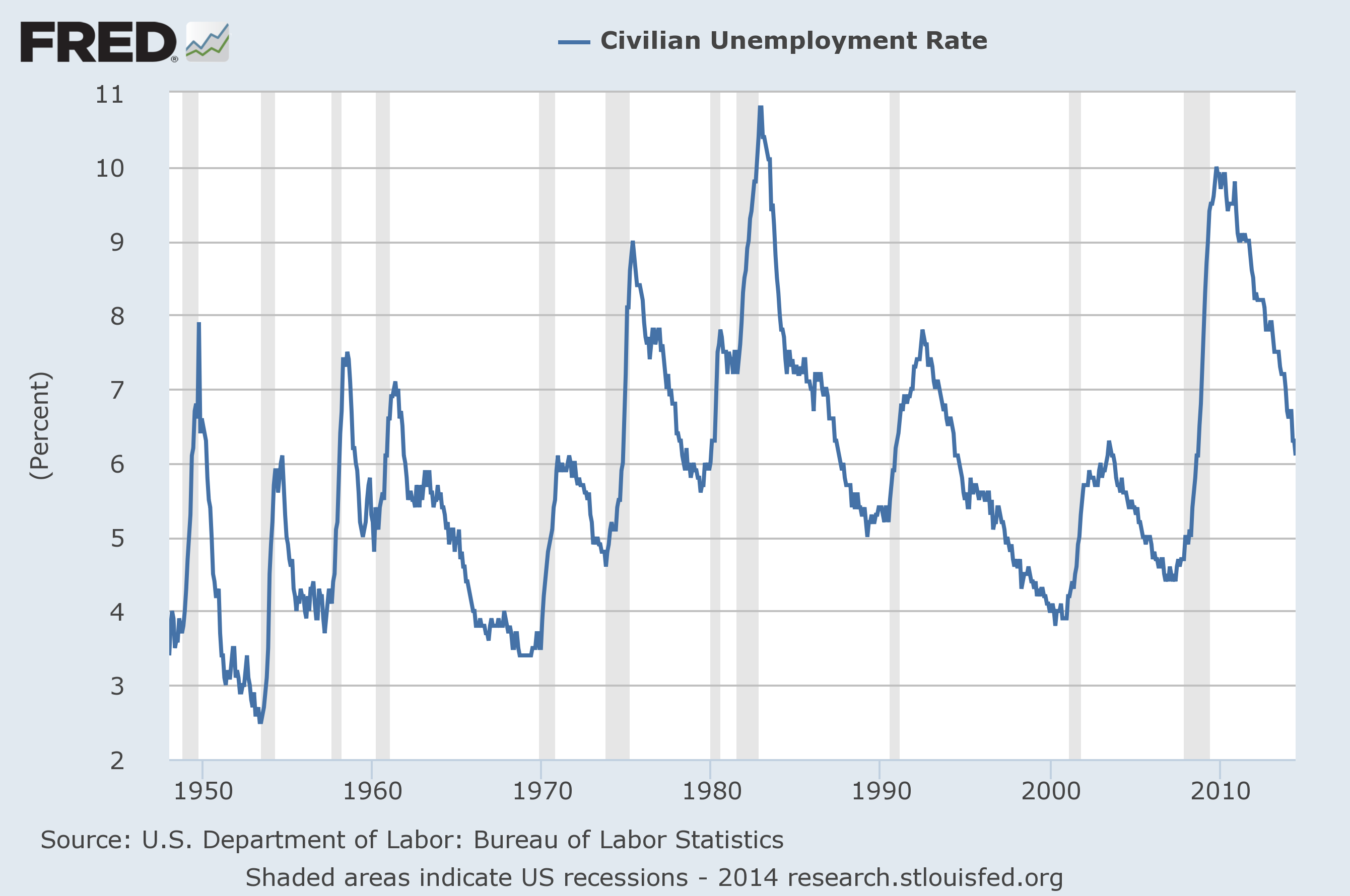
First, the unemployment rate has continued to decline, though it remains elevated. Clearly, unemployment is moving in the right direction and does not show signs of stalling or reversing. Even if we expand unemployment to include marginally attached workers (chart below), the situation is still improving. Given the magnitude of the financial crisis, it's not hard to believe that the recovery will take much longer than for a less serious recession. Furthermore, the improvements in both measures of unemployment appear to be accelerating. While I can't predict the future, that certainly doesn't fit with the idea of a slowing economy.
(click to enlarge)
This leads me back to the point I mentioned above about the narrative. Much of the doom and gloom outlook on the economy is politically motivated. It doesn't matter what your political views are; keep them out of your investing decisions.
(click to enlarge)
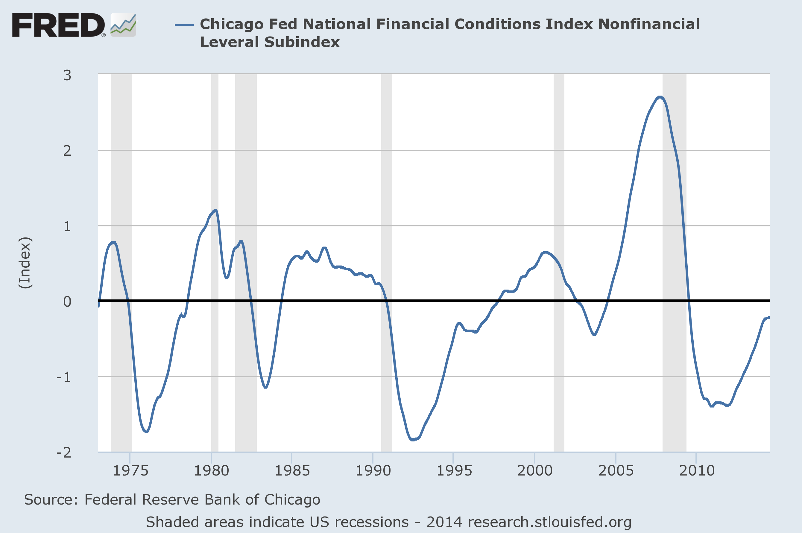
There is one final point I would like to make about the absence of a market bubble. The chart above is the National Financial Conditions Index (NFCI) subindex (one of three) measuring nonfinancial leverage. From the Federal Reserve website:
The three subindexes of the NFCI (risk, credit and leverage) allow for a more detailed examination of the movements in the NFCI. Like the NFCI, each is constructed to have an average value of zero and a standard deviation of one over a sample period extending back to 1973. The risk subindex captures volatility and funding risk in the financial sector; the credit subindex is composed of measures of credit conditions; and the leverage subindex consists of debt and equity measures. Increasing risk, tighter credit conditions and declining leverage are consistent with tightening financial conditions. Thus, a positive value for an individual subindex indicates that the corresponding aspect of financial conditions is tighter than on average, while negative values indicate the opposite.Just one more sign that we may not be on the edge of a cliff. No recession, in the data provided, started when the leverage subindex had a negative value. It provided a good warning about the financial crisis and some degree of warning before the dot-com bubble burst. The economic data points to continued recovery, not recession.
The nonfinancial leverage subindex of the NFCI best exemplifies how leverage can serve as an early warning signal for financial stress and its potential impact on economic growth. The positive weight assigned to both the household and nonfinancial business leverage measures in this NFCI subindex make it characteristic of the feedback process between the financial and nonfinancial sectors of the economy often referred to as the "financial accelerator." Increasingly tighter financial conditions are associated with rising risk premiums and declining asset values. The net worth of households and nonfinancial firms is, thus, reduced at the same time that credit tightens. This leads to a period of deleveraging (i.e., debt reduction) across the financial and nonfinancial sectors of the economy and ultimately to lower economic activity.
Just to be clear, I'm not saying that there will be 10 more years to this bull market. My point is simply that claims of a market bubble are fairly weak. Even if there is a bubble, I would be willing to bet that most pundits are wrong about the reasons, and they only get the timing correct by luck. That's just how the market works; it's only easy in hindsight.