3 Charts That Bust the Inflation Myth
| May 22, 2011
A little over a year ago I stood at the podium at the 12th Annual Investment U Conference in San Diego, California – and delivered a simple, yet hard-hitting message:
Don’t buy into the fear mongering about hyperinflation. It’s not coming. Period.
At that point, most folks in the room dismissed me as a crackpot. After all, the inflationistas had saturated our brains with a particularly convincing piece of propaganda. So convincing that even the mainstream media, including Glenn Beck, paraded it in front of millions of viewers.
I’m talking about the chart below, which shows the exploding growth in the monetary base.
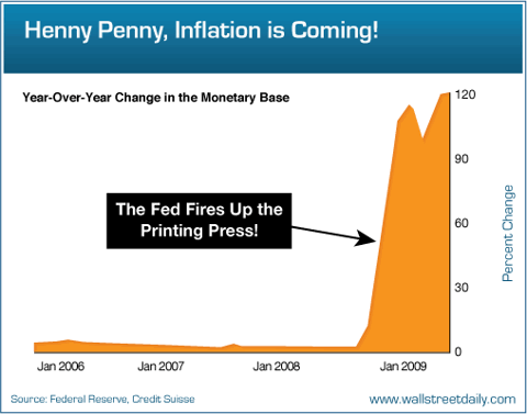
Never in the history of the world had we witnessed such a rapid increase in the monetary base. And the natural argument that followed read something like this: With the Federal Reserve “printing” so much money, forget inflation… hyperinflation was inevitable.
There was just one problem though. Nobody was taking into account the other half of the story – the massive deflationary forces at work. I’m talking about the trillions of dollars being sucked out of the system by the U.S. housing collapse and the reduction of personal credit lines.
I’ll spare you the economic lessons about excess manufacturing capacity, high unemployment and non-existent wage growth. Suffice it to say, they posed obstacles to the hyperinflation argument, too.
The Sweet Aroma of Vindication
Fast forward to today. Sure enough, we’re not even close to witnessing hyperinflation. The latest Consumer Price Index reading revealed a mere 3.2% increase in prices over the last 12 months.
But wait, government data is flawed, right?
Maybe. But “alternative” inflation calculations still yield a figure that’s a long way from qualifying as “hyperinflation.” The latest analysis from Nomura’s Richard Koo underscores why.
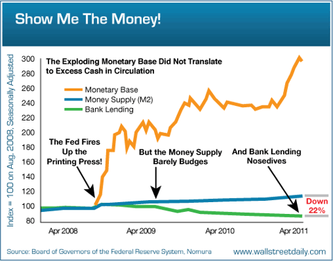
As you can see, the monetary base did indeed explode. But the Fed’s money didn’t actually make its way into circulation. In fact, M2 barely budged. (M2 is a measure of the money in bank reserves, checking accounts, savings accounts, money market funds and certificates of deposit under $100,000.) Not to mention, bank lending dropped by double digits. And without new lending, which multiplies the money added into the system by the Fed, it’s hard for inflation to take root.
Bottom line: All the Fed’s money printing did not flood the world with cash. It basically got stuck in bank reserves. And hyperinflation, as measured by a sharp rise in consumer prices, isn’t possible under such conditions.
So Where’s the Money Going?
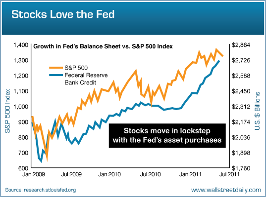
It’s foolish to think that the freewheeling Fed isn’t impacting the economy or market somehow. In fact, Bernanke & Co. are actually having an effect… on stocks!
As the Fed’s balance sheet has expanded, share prices have moved in lockstep, charging higher.

It’s important to note that such a strong correlation between growth in the Fed’s balance sheet and stock prices isn’t typical. If we extend the chart back as little as six months, the correlation breaks down. But we can’t dismiss or downplay the current situation. It’s clear that the Fed’s printing of money to purchase Treasuries is forcing investors to put money to work elsewhere. Mostly in stocks.
So how do you hedge against inflation? Buy stocks!
That’s something Dr. Jeremy Siegel, a Professor of Finance at The Wharton School of the University of Pennsylvania, discovered long ago.
His studies revealed that no asset’s come close to matching the inflation-adjusted returns of stocks for the past 200 years. Not Treasury Inflation-Protected Securities (TIPS). Not silver. Not gold.
I just hope you didn’t abandon stocks a few years ago, when the media was awash with prognostications about hyperinflation. If you did, you’re missing out!
Don’t buy into the fear mongering about hyperinflation. It’s not coming. Period.
At that point, most folks in the room dismissed me as a crackpot. After all, the inflationistas had saturated our brains with a particularly convincing piece of propaganda. So convincing that even the mainstream media, including Glenn Beck, paraded it in front of millions of viewers.
I’m talking about the chart below, which shows the exploding growth in the monetary base.

Never in the history of the world had we witnessed such a rapid increase in the monetary base. And the natural argument that followed read something like this: With the Federal Reserve “printing” so much money, forget inflation… hyperinflation was inevitable.
There was just one problem though. Nobody was taking into account the other half of the story – the massive deflationary forces at work. I’m talking about the trillions of dollars being sucked out of the system by the U.S. housing collapse and the reduction of personal credit lines.
I’ll spare you the economic lessons about excess manufacturing capacity, high unemployment and non-existent wage growth. Suffice it to say, they posed obstacles to the hyperinflation argument, too.
The Sweet Aroma of Vindication
Fast forward to today. Sure enough, we’re not even close to witnessing hyperinflation. The latest Consumer Price Index reading revealed a mere 3.2% increase in prices over the last 12 months.
But wait, government data is flawed, right?
Maybe. But “alternative” inflation calculations still yield a figure that’s a long way from qualifying as “hyperinflation.” The latest analysis from Nomura’s Richard Koo underscores why.
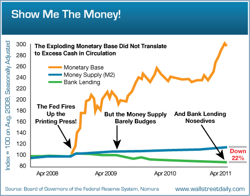
As you can see, the monetary base did indeed explode. But the Fed’s money didn’t actually make its way into circulation. In fact, M2 barely budged. (M2 is a measure of the money in bank reserves, checking accounts, savings accounts, money market funds and certificates of deposit under $100,000.) Not to mention, bank lending dropped by double digits. And without new lending, which multiplies the money added into the system by the Fed, it’s hard for inflation to take root.
Bottom line: All the Fed’s money printing did not flood the world with cash. It basically got stuck in bank reserves. And hyperinflation, as measured by a sharp rise in consumer prices, isn’t possible under such conditions.
So Where’s the Money Going?
It’s foolish to think that the freewheeling Fed isn’t impacting the economy or market somehow. In fact, Bernanke & Co. are actually having an effect… on stocks!
As the Fed’s balance sheet has expanded, share prices have moved in lockstep, charging higher.
It’s important to note that such a strong correlation between growth in the Fed’s balance sheet and stock prices isn’t typical. If we extend the chart back as little as six months, the correlation breaks down. But we can’t dismiss or downplay the current situation. It’s clear that the Fed’s printing of money to purchase Treasuries is forcing investors to put money to work elsewhere. Mostly in stocks.
So how do you hedge against inflation? Buy stocks!
That’s something Dr. Jeremy Siegel, a Professor of Finance at The Wharton School of the University of Pennsylvania, discovered long ago.
His studies revealed that no asset’s come close to matching the inflation-adjusted returns of stocks for the past 200 years. Not Treasury Inflation-Protected Securities (TIPS). Not silver. Not gold.
I just hope you didn’t abandon stocks a few years ago, when the media was awash with prognostications about hyperinflation. If you did, you’re missing out!